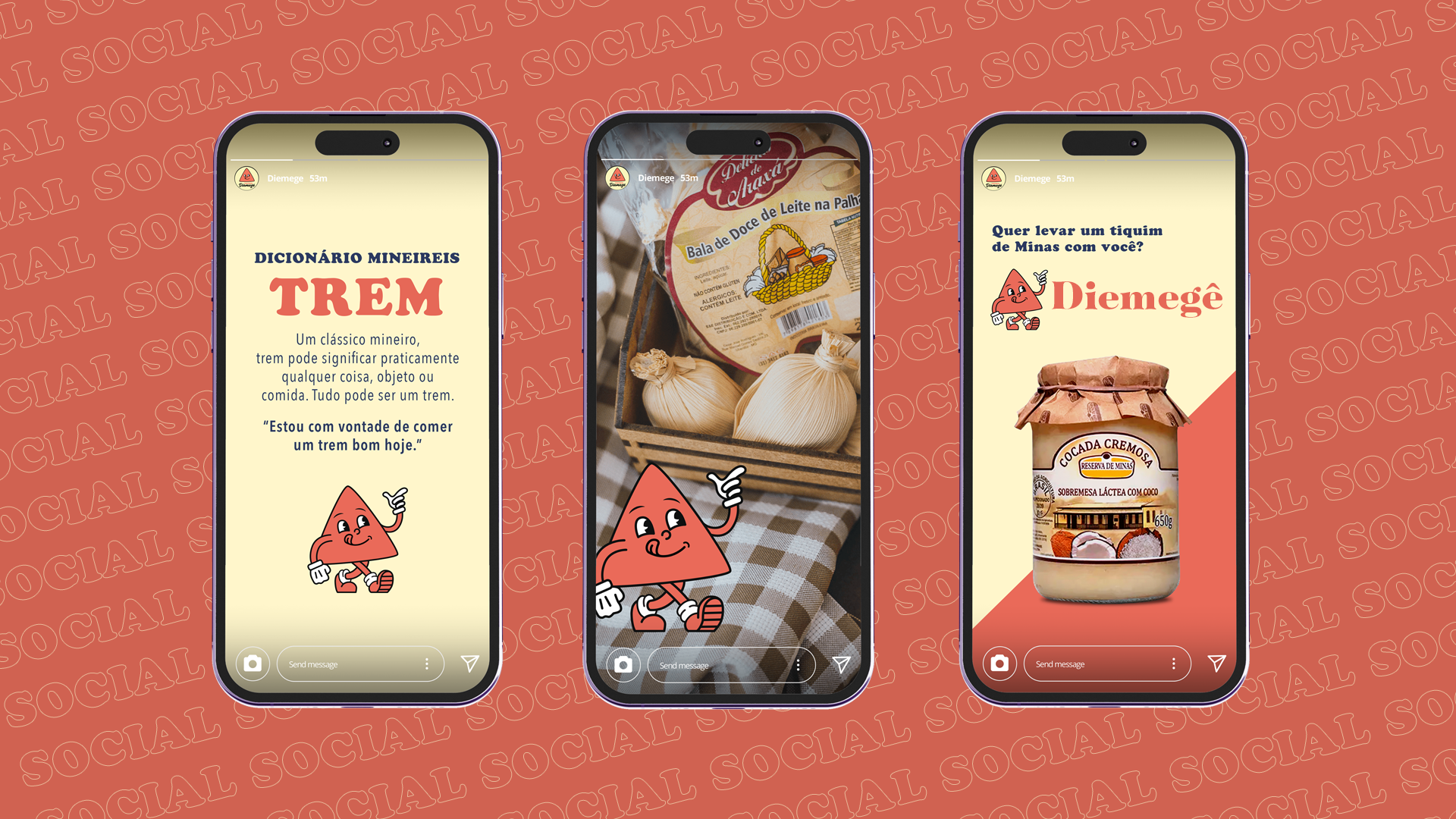
Role: Concept & Design
Diemegê was created to bring a piece of Minas Gerais to every corner of Brazil. More than a distributor of regional products, the brand celebrates the culture, warmth, and traditions that have made Minas Gerais one of the country's most beloved regions.
The Challenge
Develop a brand identity that could translate this regional authenticity into a modern, approachable, and memorable visual system, one that felt unmistakably mineiro without relying on clichés.
The Creative Approach
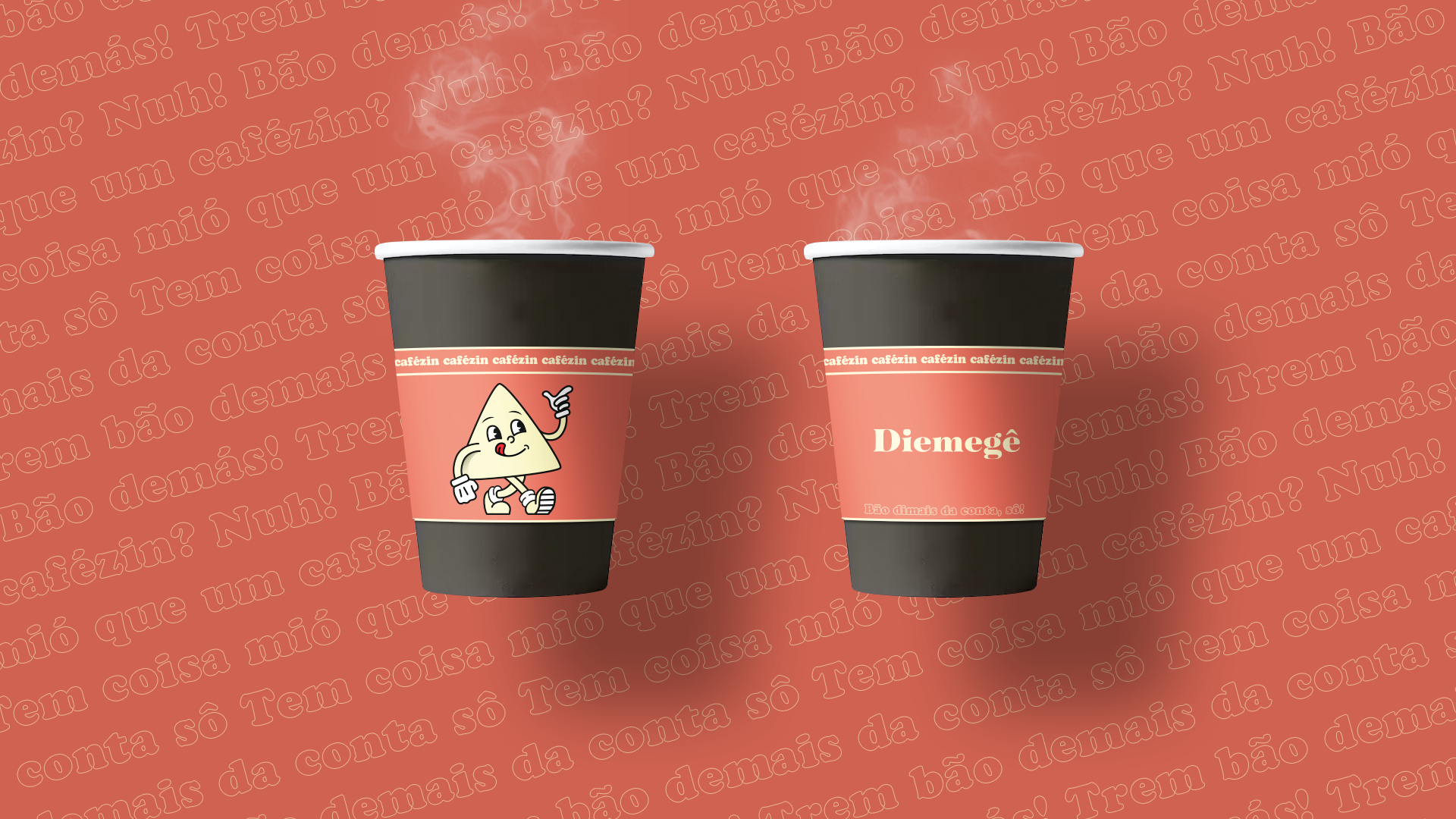
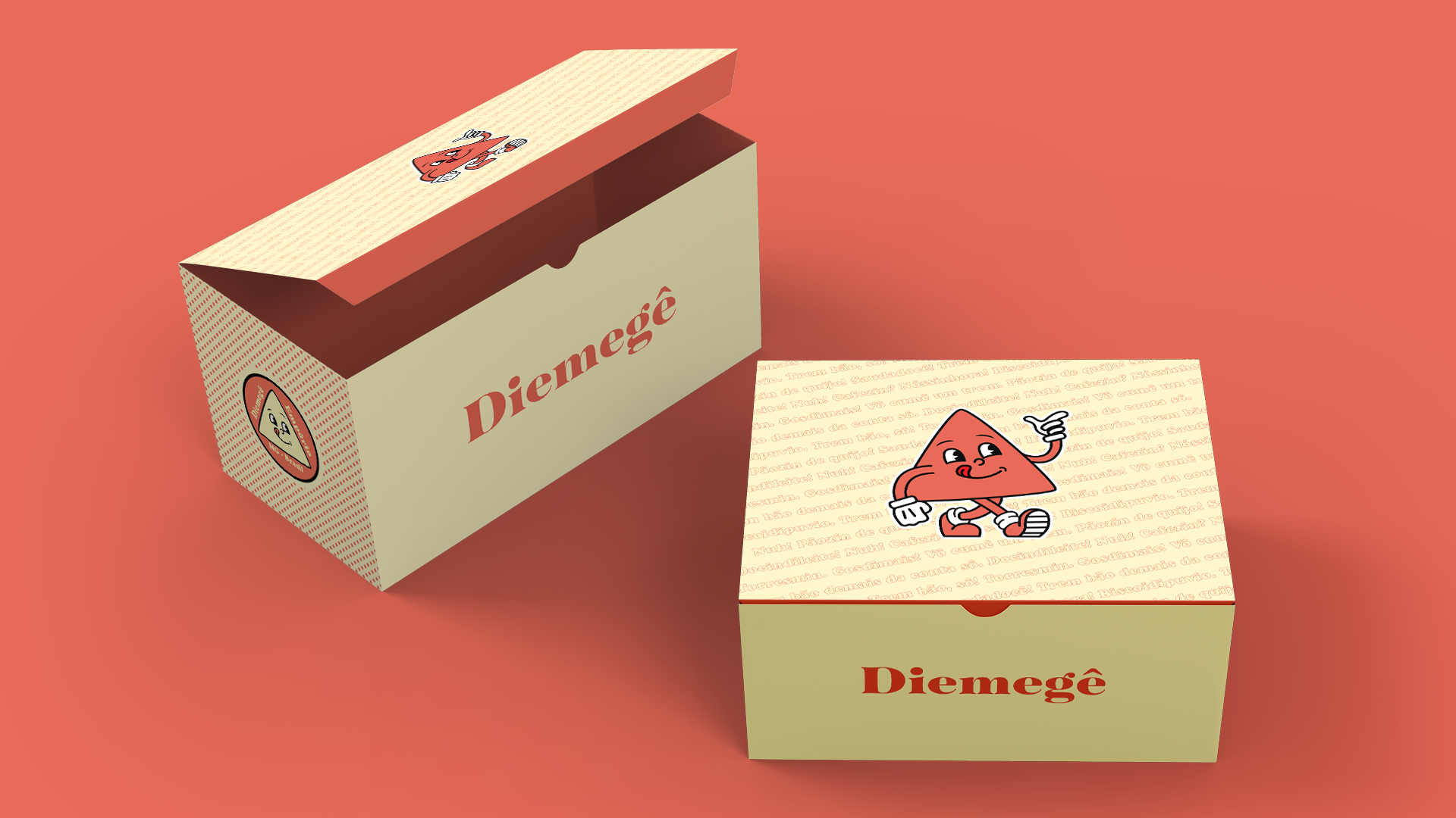
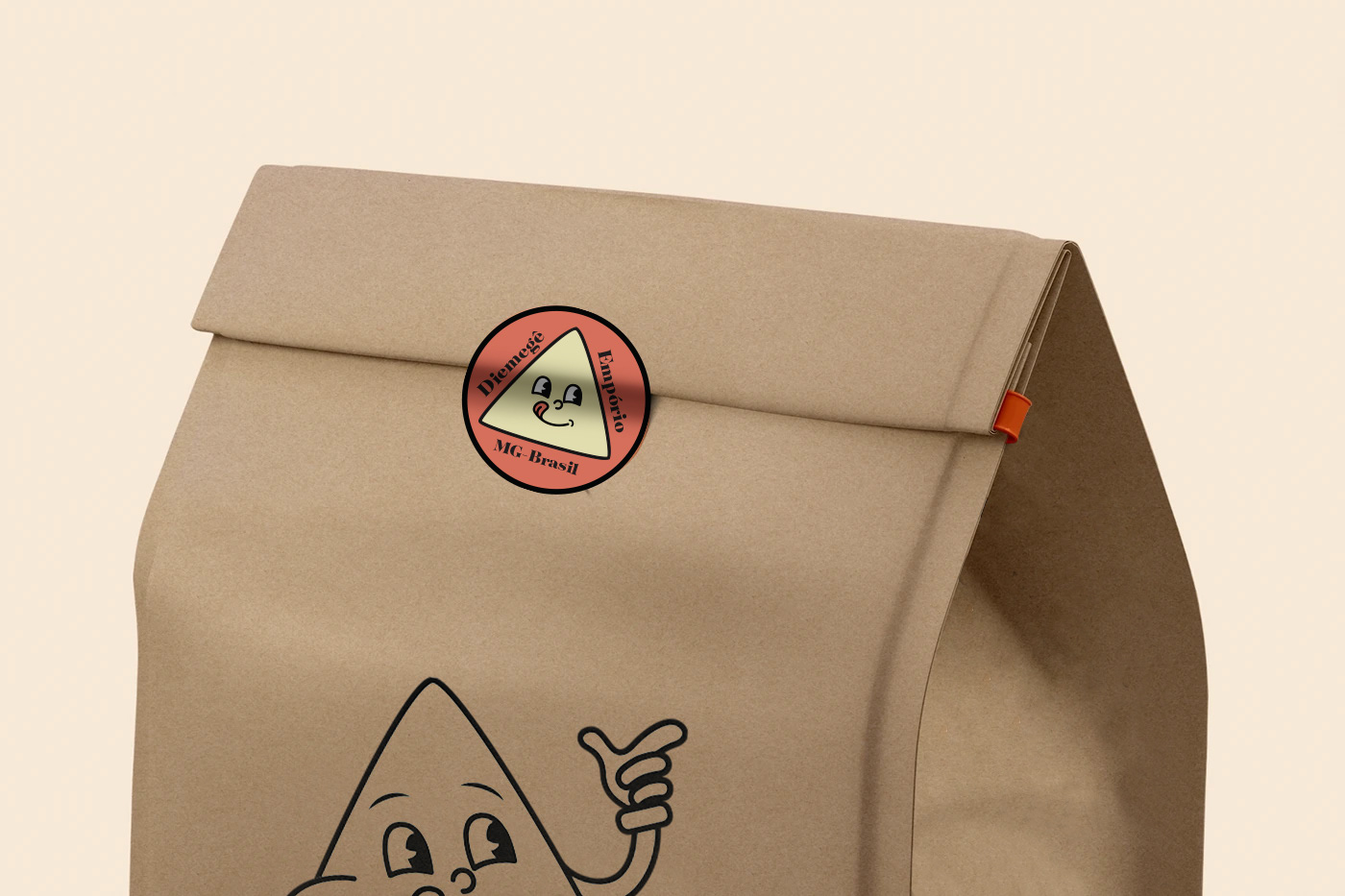
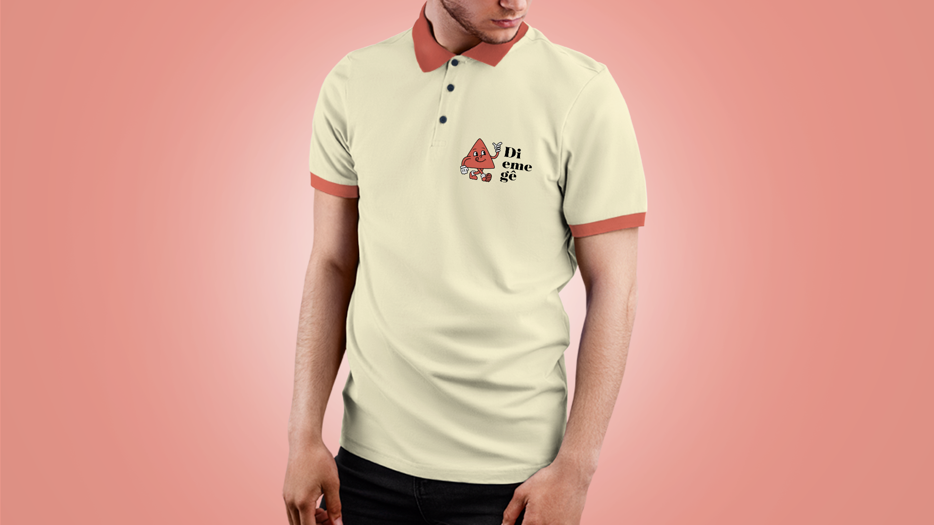
The identity draws inspiration from one of Minas Gerais' strongest visual symbols: the red triangle from the state's flag. Instead of using it as a static emblem, we transformed it into a friendly mascot that embodies the warmth, hospitality, and approachable spirit of the brand.
By turning a historic symbol into a recognizable character, the visual system became flexible enough to live across packaging, social media, retail materials, and branded experiences while maintaining a strong connection to the state's heritage.